Wednesday 12 September 2012

SIGGI EGGERTSSON - Landscape Illustrations


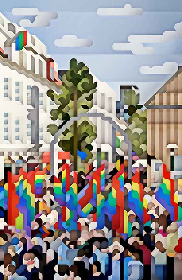
Okay so I don't necesssarily love the appearance of these illustrations, they're a bit too computer-graphicy for me. But I do love the idea of breaking up what YOU see. Links again into using marks to interpret the scene infront of you as opposed to painting exactly what you see.


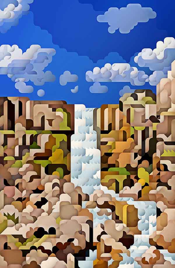
All images from: http://trendland.com/siggi-eggertssons-landscape-illustrations/

Sunday 9 September 2012

FABINAO BUSDRAGHI - Infinite Palaces and Buildings. YES I KNOW ITS NOT PAINTED JUST LISTEN OKAY.


http://trendland.com/fabiano-busdraghi-infinite-palaces-buildings/

I think this falls into the category of artists not necessarily painting exactly what's in front of them, instead using their mark making to interpret and create rhythm in their paintings. ITS THE IDEA NOT THE PAINTING OKAY GUYS.

ROBERT BEVAN - Dunn's Cottage (1915)

Robert Polhill Bevan:Dunn's Cottage
http://www.1st-art-gallery.com/Robert-Polhill-Bevan/Dunn's-Cottage.html

Really loved the purple and green colour combinations, unusual partnership but can see purple in the base colour of the greens so ties the painting together, rather than the two colours jarring. Like the thick, square brushstrokes.

EDWARD WARDSWORTH - Requiescat (1940)


http://hannahbyatt.blogspot.co.uk/2012/03/edward-wadsworth-percy-wyndham-lewis.html

Shitty image but I've got a postcard of this so it doesn't really matter for sketchbook purposes.
Main focus was on the pebbles, the shadows on each individual rocj if created by overlapping, singluar brush marks.

JACK BUTLER YEATS - Off the Irish Coast (1942)

Off the Irish Coast
http://www.bbc.co.uk/arts/yourpaintings/paintings/off-the-irish-coast-38074

Different to Loiseau's abstract nature as I feel this does have a sense of depth, mainly because of the strong black accents. No detail but the marks create the illusion, very little blending  - this happens actually on the canvas. DIRECTIONAL, strong brush strokes separate the horizontal sea, vertical rocks and multi directional sky.
Oh yeah the colours are also YUM.

JOHN PIPER - Stair Hole, Lulworth (1948)

Stair Hole, Lulworth
http://www.bbc.co.uk/arts/yourpaintings/paintings/stair-hole-lulworth-7993

Love the combination of dry and wet brush strokes, where the former pick up the texture and only cling to certain parts of the painting. Splatters, watery colour combination and strong painting with lots of texture. Also like how the brightness of the white is not lost, could have easily picked up a smidgen of black which would have dulled it down.

Saturday 8 September 2012

GUSTAVE LOISEAU - Port de Goulphar, Belle-Ile-en-Mer (Bout 1900)

Port de Goulphar, Belle-Ile-en-Mer by Gustave Loiseau
http://www.yorkshiresfavourites.org/paintings/port-de-goulphar-belle-ile-en-mer.html

Again saw this in York Art Gallery, love the impressionist style, how colours from the mountains and sand can be found in the sea and vice versa. In paintings where I see this use of colour I seem to look at them in a flat way, even though there is kind of depth in the shading around the shoreline.